Action buttons
Action buttons allow users to trigger screen actions via the device’s physical buttons while a screen is active. Unlike screen components, which are laid out within the screen view, action buttons are associated with the four physical buttons and defined at screen level, not for individual screen views. Their position is adapted based on the hand preference and screen orientation.
By default, no action buttons are assigned.
To define an action button, the following attributes are required:
Reference ID – Used to uniquely identify the action button within the screen and to reference it inside screen context of the events (e.g., to determine which action button was clicked)
Screen action – Defines what should happen when the button is pressed
Indicator appearance (text & color) – The label shown on the screen edge next to the physical button to which the action button is assigned.
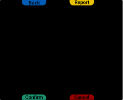
Positioning and hand preference
Each action button is defined using a relative position, describing where its associated label appears next to the screen edge:
Front-Outside – Knuckle-side, pinkie-edge
Front-Inside – Knuckle-side, thumb-edge
Back-Outside – Wrist-side, pinkie-edge
Back-Inside – Wrist-side, thumb-edge
These relative positions are dynamically mapped to the physical buttons based on the hand preference (left-handed or right-handed usage).
This remapping ensures ergonomic consistency — for example, inside action buttons will always be within reach of the thumb, regardless of which hand is used. This is especially important for actions that require frequent interaction.
Caution
While each physical button has a fixed physical ID, this cannot directly tell you which action button was triggered, because action buttons are not permanently tied to specific buttons.
Use the screen context and the button's fixed physical ID together to resolve which action button was activated at runtime.
Appearance: on-screen indicator
Action buttons are rendered visually on the edge of the screen, aligned with the physical buttons. This gives users a clear visual mapping between the button they press and the screen behavior it triggers.
Each action button's appearance includes:
Label text
Indicator color
This visual styling is always shown while the screen is active and adjusts according to hand preference.
Supported screen actions and behavior
Each action button triggers a specific screen action when pressed:
Navigate back – Closes the current screen and returns to the previous one (if any). Useful for creating manual back navigation in workflows.
Notify – Triggers a button event that includes screen context and the physical button index. Each physical button has a fixed and predefined index that does not change with orientation or hand preference settings. However, the visual position of the action buttons on the screen can vary depending on hand preference. To determine which action button was clicked, use the screen context along with the physical button index.
The SDK also provides a helper method:
ButtonPress.getCorrespondingPgActionButtonReferenceId(), which returns the reference ID of the action button assigned to the pressed physical button at the time of the event.Click on screen component – Simulates a click on a defined screen component on the same screen. Useful to bridge interactions between physical buttons and UI components with implicit behaviors (e.g., opening the keyboard for a text field with assigned input method).
None – Disables the button without removing it visually. Useful for disabling inputs without altering screen layout.
Code (SDK)
//...

fun createSampleActionButtons(): PgActionButtons {
    val buttonFrontOutside = PgActionButton.Assigned(
        referenceId = "backActionButton",
        onSingleClick = PgScreenAction.NavigateBack,
        indicatorAppearance = PgActionButton.IndicatorAppearance(
            text = "Back",
            indicatorColor = IndicatorColor.Blue
        )
    )

    val buttonFrontInside = PgActionButton.Assigned(
        referenceId = "affirmativeActionButton",
        onSingleClick = PgScreenAction.Notify,
        indicatorAppearance = PgActionButton.IndicatorAppearance(
            text = "Correct",
            indicatorColor = IndicatorColor.Green
        )
    )

    val buttonBackInside = PgActionButton.Assigned(
        referenceId = "adjustActionButton",
        onSingleClick = PgScreenAction.ClickOnPgScreenComponent(
            referenceId = "textFieldWithInputRefId"
        ),
        indicatorAppearance = PgActionButton.IndicatorAppearance(
            text = "Adjust",
            indicatorColor = IndicatorColor.Red
        )
    )

    return PgActionButtons(
        frontOutside = buttonFrontOutside,
        frontInside = buttonFrontInside,
        backInside = buttonBackInside,
        backOutside = PgActionButton.Unassigned
    )
}

//...