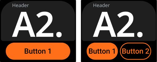
On-screen buttons
In addition to physical buttons, some of the MAI templates support on-screen touch buttons.
Interaction: Touch
Strengths: Clear context, low learning curve
Limitations: Requires visual attention
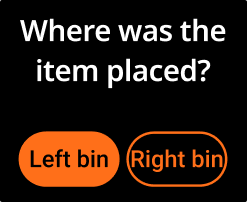
Depending on the template, there may be one or two buttons available.
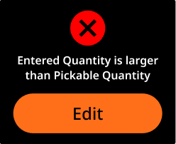
In one-button templates, the button is typically used for a single primary action (e.g., "Confirm" or "Continue").
In two-button templates, the buttons are mapped to primary and secondary actions.
The primary action is always represented by a filled button.
The secondary action is always represented by an outlined button.
When to use
One button:
Use for simple workflows requiring one clear action, such as "Confirm" or "Next". Keeps interactions straightforward and efficient.
Two buttons:
Use when you need a primary action with an alternative option. Example: "Confirm" (primary) with "Cancel" (secondary) for escape routes or different workflow paths.
🟢 Best practices
 Use one-button templates for simple, linear steps. | 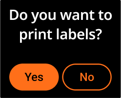 Use two-button templates only when two distinct actions are needed. | 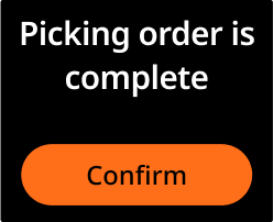 Keep labels short, clear, and action-based. |
Assign the primary (filled) button to the more frequent or default action.
Keep labels short, clear, and action-based.
Make buttons easy to understand without training.
🔴 Avoid
 Avoid equal actions without clarifying which is more frequent. | 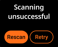 Don’t use vague or similar labels (e.g., “Rescan” and “Retry”). | 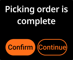 Don’t add a second button unless it serves a necessary decision point. |