Physical buttons
In addition to on-screen buttons, MAI has physical buttons located on the sides of the device.
Interaction: Tactile
Strengths: Fast, can be used without looking
Limitations: May require memory or reliance on visual indicators
Indicators
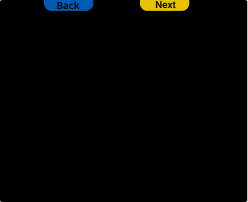
Physical buttons have small on-screen indicators that show their current function. MAI supports up to 6 indicator colors. Use colors to communicate distinct functions — each color should map to a unique action across the flow.

When to use
Users need to navigate (e.g., "Back" or "Next") through screens
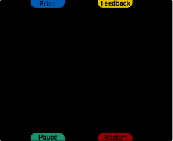
You need more than two actions on a single screen
Actions need to be triggered quickly without visual confirmation
You want to keep the screen clean and focused while still supporting multiple interactions
Functionality
Currently, physical buttons cannot cycle through interface elements, such as moving between list items or workflow fields using directional navigation.
However, physical buttons can trigger specific elements by referencing their assigned IDs. For Workflow and List templates, you can assign an ID to a field and then map a physical button to activate that specific element.
🟢 Best practices
 Use physical buttons for navigation and repeated actions (e.g., "Back" or "Next") | 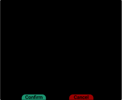 Use indicator colors to reinforce meaning (e.g., green for "Confirm", red for "Cancel") | 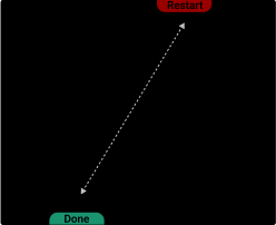 Place critical actions away from commonly pressed or easy-to-reach buttons. |
Keep button mapping consistent across screens when possible.
Use clear and distinct actions per button.
🔴 Avoid
 Don’t overload users with too many rarely-used actions | 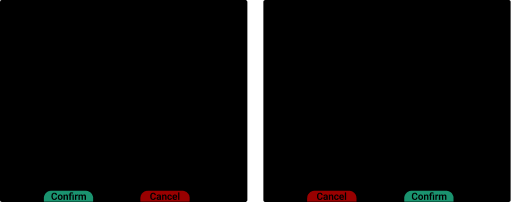 Don’t change button meanings from screen to screen unless necessary |