List templates
Lists provide users with selection options from menus, item lists, or exception handling during workflows. They're essential for navigation and decision-making processes.
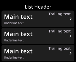
Structure and components
Lists consist of a header and up to six list items. Each list item can be customized to contain any or all of the following components:
Main text
Underline text
Trailing text
A trailing icon
When to use
Use lists when users need to choose from multiple options, navigate between screens, or select items from a catalog or inventory. Lists work well for settings menus, workflow step selection, error resolution options, or any scenario where users must pick from a defined set of choices.
Trailing and underline text can provide additional context if necessary.
Pagination
When displaying more than six items in a list, templates can be paginated to support additional content.
List templates support up to three swipeable pages to display up to 18 items. Users interact with pagination via swipe gestures.
Note
Workflow and List templates can be paginated; Notification templates cannot.
Only templates within the same category can be combined (Workflow with Workflow, List with List).
Template naming
There is only one List template — PgListT1. The template can be customized to contain any of the components described in Structure and components.
See List templates for examples of how this template can be customized.