Visual guidance and field states
MAI Workflow templates support two types of visual guidance that help workers quickly understand where to focus:
A small icon placed next to the field label (e.g., play icon, checkmark, exclamation, red "x" icon)
A highlighted field (colored background) that visually emphasizes the field's status
Fields can be assigned one of four different states: focused, success, warning, or error. When a state is assigned to a field, an icon appears next to its header. You can also choose to highlight the field with a background color. See the table below to view the icons and colors associated with each state.
State | Icon only | Icon and highlight field |
|---|---|---|
Focused Icon: play Color: blue | 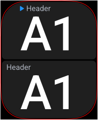 | 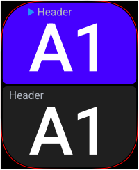 |
Success Icon: checkmark Color: green | 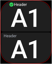 | 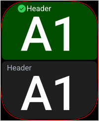 |
Warning Icon: exclamation mark Color: yellow | 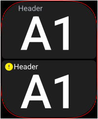 | 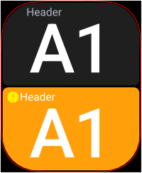 |
Error Icon: 'X' Color: red | 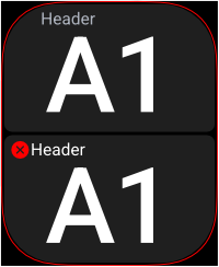 | 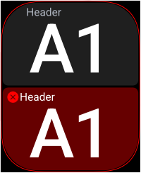 |
Note
Visual guidance is crucial for letting users know where they are and what to do next.
When to use
Icon only | Icon and highlighted field |
|---|---|
|
|
Tip
As a rule of thumb, use icon only for soft guidance, and combine it with a highlighted field for emphasis.