User feedback
MAI can provide user feedback through LED, vibration, and audio signals, similar to existing ProGlove scanners. Feedback patterns are predefined by ProGlove, though basic settings like volume and on/off controls can be set in Configuration.
Notification templates provide additional visual feedback directly on the screen.
When to use notification templates
While LED lights offer basic status indication, Notification templates can display detailed context with icons, text, and color-coded information.
Use Notification templates when context matters more than speed — for explaining errors, providing instructions, or showing progress updates that help workers make informed decisions.
Note
Notification templates currently support five types: scan, success, error, warning, and info notifications.
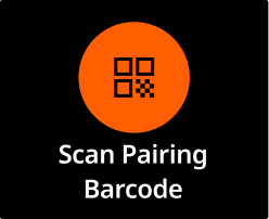 | Scan |
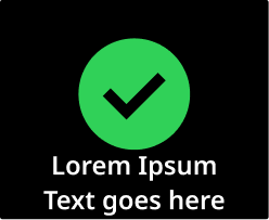 | Success Use when an action was completed as expected (e.g., item scanned, task finished). Reassures the user, builds trust. |
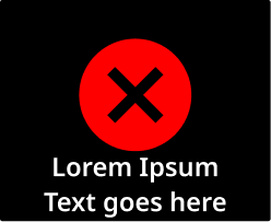 | Error Use when the system can't proceed or a task was not completed. (e.g., wrong item, invalid input). Should be clear, persistent, and require acknowledgment if critical. If the error is fixable, introduce physical or on-screen buttons to provide interactions for the user. |
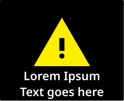 | Warning Use when there is a discrepancy, but the user can still continue (e.g., item mismatch, optional step skipped). Can be used to prevent mistakes before they happen. |
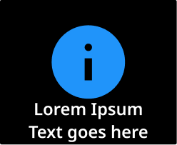 | Info Use for neutral updates or background messages (e.g, "Battery low", "New task assigned"). Avoid overusing - if everything is "info," nothing stands out. |
Tip
Keep notifications useful, not noisy. Overusing them reduces their impact.
🟢 Best practices
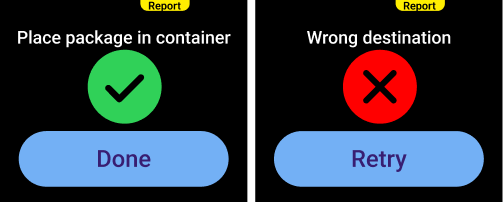 | Inform the user: Use notification screens to inform the user whether the process step was successful or not, and to display information or a warning. Buttons: If you mapped the buttons on the notification screen, make them actionable. Copy: Keep it short and clear. You can use specific, technical words, if you're sure workers will understand it. |
🔴 Avoid
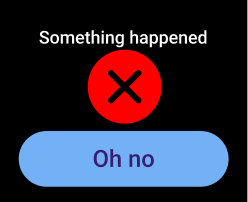
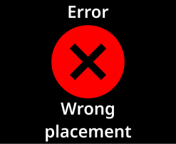 | Lack of context: Don't show an error if the user can't act on it or do anything to resolve it. This creates a dead end and can confuse or frustrate the worker. |
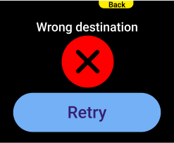 | Button duplicates: Avoid mapping the same action in multiple ways. In this example, "Back" and "Retry" both trigger the same outcome. Exception: Technical issues, or clear 50-50 preferences amongst your workers for physical vs. on-screen touch button. |
 | Vague button text: Button text should clearly set expectations. Avoid vague labels. Exception: Your process might require the worker to acknowledge an error. In that case, you could add an "OK" button. However, we advise against it, since it doesn't lead to any real action. |
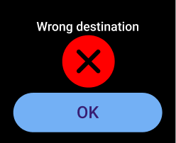
 | Confusing text: Use short and clear copy. Do not use vague terms where the user will have to guess what happened. |
View all notification templates in the Template library.